
INTRODUCTION: Relationship between Interior Designing & Colors
Colours have an energy of their own. Since our visual apparatus is intricately linked to our minds, we often perceive different colours with different traits. For example, warm colours are often perceived as more welcoming, so they have a higher tendency to grab attention. While cooler colours are often perceived as serene, they offer a highly soothing and calm vibe.
Colour Psychology is a discipline that is dedicated to studying the impact of colour on our moods and state of mind. It gives theoretical and scientific explanations of how colours trigger a particular emotion. It is one of the major tools used in the Interior Designing Industry. Its significance can be highlighted because it is often labelled as the ‘Building Block of the Interior Designing’.
Interior Designing is an Industry that is heavily influenced by colour trends. Since colours play a significant role in accentuating the design with its texture, Interior Designers know how to play with the colours to design the perfect place for your preferred usage. It can be said that Colors can make up or break up your place. Choosing an appropriate colour for space is a task that should be done carefully, ensuring little to no scope for error.
Colour Psychology is a disciplinary approach that studies how a particular colour impacts energy levels and the state of mind. As a result, certain colours are brought into use by the Interior Designer, depending upon the theme or the room type that the client prefers.
For a naturalist theme, the best-suited colours would be blue or green. While for a lively-vibed room, the best-suited colours would be red and yellow. For someone who wants a minimalist theme, the creamy-whitish colour of interiors with dark shaded.
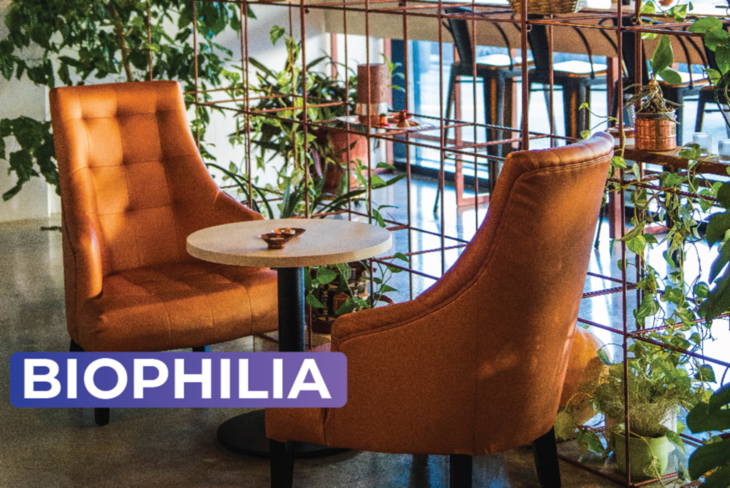
Biophilia is a term used for Naturalist themes in Interior Designing. Since the interior design in this theme is nature-centric, there is more and more prominence of the soothing Natural Colors.
Natural Colors:
Natural Colors will be some of the most preferred colours that will be trending in the upcoming years. It is because these colours help us in better connectivity with nature. Hence these colours are some of the most soothing colours one can use to make his place soothing. These colours will help offer the place a more comfortable, cosy look with a sense of the belonging and aesthetic vibe.
Blue:
Blue is a cool colour, which is one of the most soothing and serene colours among all the colours. It often symbolizes intellect, integrity & trust. It is probably because we are all surrounded by the blueness of the sky, which is beautifully mirrored by the Oceanic Waters and River Waters, which are the key components that sprinkle the liveliness by the rejuvenation of nature.
Green:
Green is a cool colour, one of the other more prominent natural colours we often perceive as a symbol of abundance. Plus Greenness of the vegetation around us gives us a lively vibe while maintaining that aesthetic look, as they act as a mode of living since they give us oxygen while maintaining Carbon emissions levels are also regulated to optimum levels because of them.
Yellow:
Yellow is a warm colour, one of the most admired colours due to its warmness. It is often perceived as a warmly welcoming colour. We must acknowledge that it is one of the most energetic colours. Our perception of it as a highly vibrant colour is due to the Sun, the major source of energy in the solar.
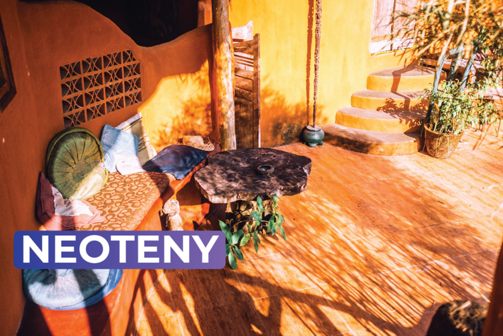
Neotenic as an interior designing technique can be defined in simple terms as an art of exaggerating childlike features to give the room a lively look by enchanting it with the energy of a child. Vivid & Dynamic colours are more prominently used in the Neotenic.
Vivid Colors: Vivid Colors are some of the most dynamic colours that tend to fill up the space with a highly charged vibe. Day by day, more and more people prefer a room that is very lively and energetic; vivid colours have gained prominence. These colours offer the place a look that pops up very well; subconsciously, these colours are associated with Optimistic vibes.
Red:
Red is one of the most vivid colours that symbolise passion for us at an unconscious level. It is because it is very dramatic, bold, and warm, with the largest wavelength, making it eye-catchy. It is a colour that makes a Physical Presence with boldness.
Yellow:
Yellow is a very influential colour that is very intensely influential. It acts as an Emotional Trigger, which is a major attention-grabbing colour. Along with it, it also symbolizes Optimism, which is because when we see yellow, we relate it to the Sun.
Orange:
Orange is one of the most compact, well-packed colours combining two of the most eye-catchy warm colours, Red & Yellow, triggering both the physical attention grabber and making an emotional impact on the client’s mind.
Even though vibrant and dynamic colours are a great way to grab the attention of an individual but what to do when more than one vibrant colours are to be included in the same frame?
To deal with it adequately, first of all, we must address the fact that vibrant colours are very demanding as they attract attention easily compared to other colours. So, putting together two different vibrant, vivid colours will cause lots of distractions for the viewer. Hence, we must try to avoid putting together two vibrant colours in the same frame.
What we can do to draw the viewer to the main primary subject while the secondary subject stays intact (which is not so important but needs to be included) is we should use vivid colours as the main subject while we can use secondary subjects with neutral colours to create a muted colour composition.
SCANDINAVIAN INTERIOR DESIGNING:
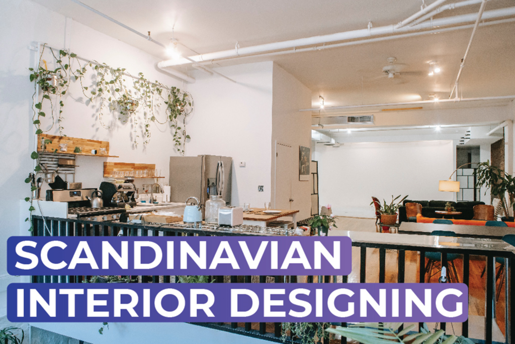
Scandinavian Interior Designing is an Interior Designing Technique used across residential places and workplaces. It is one of the most well-known Interior Designs known for its minimalism, and subtle use of muted colours, making it one of the most affordable Interior Designs that offer a highly stunning look.
Muted Colors:
Muted Colors is a term used to abbreviate Desaturated or Duller Colors. The process of muting one vivid colour occurs when the vivid colour is combined with neutral colours like White, Gray, etc.
Muted Color Combinations like Orange-Grey, Yellow-Green, Red-White, Blue-White, and Green-White are some of the most prominent colour combinations that will gain more popularity daily.
Neutral Colored Palette:
Neutral Colored Palette is one of the best-suited co-subjects with muted colours, acting as an adequate base and making the main subject highlight in the appropriate ratio compared to the co-subject.
Neutral Colors:
Neutral Color can be defined as a colour that appears without colour and does not typically appear on the wheel. Neutral Colors Virtue lies in the fact that they do not demand as much attention as is demanded by vivid colours.
Black: Black is one of the most diverse colours because of the diversity of its uses. If used smartly, black can offer an elegant look, which can be a major attention grabber. As a neutral colour, it provides a frame for vivid colours.
Gray:
Gray is one of the best neutral colours, the best-suited neutral colour in Interior Designing, as it provides a base that highlights the colours of the wall, making it a highly preferred colour as a base colour.
White:
White is one of the most significant colours for most people because it is perceived in most religions as a divine colour, which symbolizes purity. It is not a colour of its own but a manifestation of all the colours, which forms complex energy and a mystical field of light.
Brown:
Brown is one of the most underrated yet crucial colours in Interior Designing because of the subtleness of its presence. Because of that, it adds an extra layer of texture and contrast. The probability of you using the furniture, the bags, and the doors with a shade of brown is very high due to its texture and contrast. Since colours profoundly impact each aspect of our lives, be it emotions, mental state, or vibrational frequency of a place.
It is our job as Interior designers to design the place so that the client is at the peak of his comfort level while he/she is there. This assures you of your long-term harmonious clientele relationship with him; he can even recommend you to his acquaintances and colleagues, adding up to your customer base and multiplying your profits.
FAQ’S
Colours are very significant in Interior Designing because there is an intricate relationship between our mind and visual apparatus. It impacts how we perceive colour and what emotion is triggered by a particular colour.
Colour Psychology, a branch of psychology, is a dedicated discipline that studies how one colour impacts or triggers a particular emotion.
Soothing and calming colours like Blue, Green and Yellow are some of the best-suited colours for Naturalist themes in Interior Designing.
Vivid colours like Red, Green, Yellow, and Orange are some of the best-suited colours for Neotenic in Interior Designing.
Neutral colours like White, Cream, and contrast colours like shades of brown, are some of the best-suited colours for a Minimalist theme in Interior Designing.